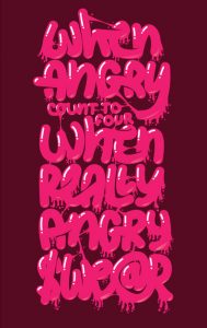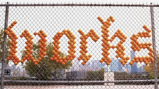

When you look at this pictures, can you tell me which one is lettering and which one is typography?
I give you a clue.
Let’s say this way. Imagine a Play Doh and a Lego.
Lettering is a Play Doh in which you can shape the clay whatever you want, anything you want.
You can stretch it, squeeze it, tear it apart, all the crazy thing you can imagine.
Do by any means to achieve your goal.
While typography is a Lego. You’ve already have a building block.
There are rules you have to obey. You can build any shape you want, but…
Remember that these plastic bricks cannot be squeezed, stretched, or teared it apart.
(actually you can, but it will hurt your hand, or at least you will wreck the brick)
We can say, in typography, you can achieve your goal with certain rules.
Now, can you guess which one is typography and which one is lettering?
No? Alright, we shall proceed.
LETTERING
In lettering we do not type letters. We do not write letters. We draw letters.
In other words, lettering is a combination of illustration and letters.
Imagine the wildest shape come to your mind, it can be achieved with lettering.
You can stretch it, break it, slice it, you can do whatever you want.
As long as it looks beautiful and your objective is achieved.

Objective means how do you want your customers to react when they see this image.
Do you want them to understand quickly, or do you want them to be surprised, or what?
Lettering is usually done by hand. When you use hand to draw letters, then it can be categorized as lettering.
It doesn’t matter what tools you use. You can use a pen, pencil, mouse, graphic pen, i-Pad, blood, sugar, sand, salt, or anything.
This is one example of Stefan Sagmeister lettering work. He uses oranges!!!

Just like what I say, it’s a Play Doh. Just use your imagination.
The biggest different between lettering and typography is on its perspective on legibility and noticeability.
In lettering, usually noticeability is more important than legibility.
It is more to WOW your customer rather than to be invisible.
TYPOGRAPHY
“Typography is two dimensional architecture based on experience and imagination, and guided by rules and readability. And this is the purpose of typography: The arrangement of design elements within a given structure should allow the reader to easily focus on the message, without slowing down the speed of his reading.”
– Herman Zapf

Differs from lettering, Typography is more orthodox than lettering.
There are certain rules you gotta obey. It’s like architecture.
You want your house to be simple, functional, comfort, just like any orthodox thing.
It’s true that there are some exception. There are some unique and unusual shape of house.
But if you are get noticed the shape of your house every time you go home,
then it has to be something wrong with that shape of your house.
These are some commandments in typography:
- Thou shalt not use more than 3 fonts in one design.
- Thou shalt know the name of the font thy used.
- Remember that it takes times to build a good font.
- And it takes forever to build a great one.
- Honor the best typographer and crucify the bad one.
- Thou shalt not stretch a letter.
- Thou shalt not put excessive space between letters.
- Thou shalt not harm a letter.
Neglect it, and thou shalt go to the typographic hell.
Use typography when you need legibility more than noticeability.
Most of the times, a font is used to be red and to be understood quickly.
When you read a newspaper and your head feel dizzy because of the letters more than the news, you can say that the font is truly piece of shit.
