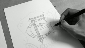
My ‘GF’ monogram is finally finished.
I want this monogram looks vintage and classy.
First, I had to choose the right typeface.
I decided to use a serif. A little contrast between thick and thin would give it a feminine taste.
The letter was inspired by Victorian era, although it’s not exactly the same.
For the ornaments: lines and swirls would fit it.
If you like this post, please share it to your friend.


