In fashion industry, typography plays significant role.
It doesn’t matter whether it’s on high fashion or on street wear.
Take a look around you. Look at the big names.
Look at Prada, Dior, Chanel, Supreme, Stussy, etc.
It’s all made with letters. In other word, it’s a LOGOTYPE.
Today we’re going to talk about 2 of the biggest brand in fashion industry.
Prada from high fashion and Supreme from street wear.
LET’S START WITH PRADA
Notice that the definition of beauty in high fashion is quite different from street wear.
When we talk about high fashion, these words tend to come to our mind:
Delicate, beautiful, elegant, feminine.
And when you are a logotype designer, your duty is to translate those words into certain kind of type.

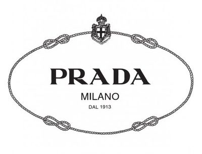
PRADA Recent Logo
Mario Prada, the owner, wants the logo looks simple, elegant, and delicate.
As a result, the logotype adopts the high contrast stroke of thick and thin.
The vertical stroke’s extremely thick, while the horizontal stroke’s extremely thin.
Prada logo is not a typeface, is not a font — eventhough it looks like a font.
It is made by hand. It is hand lettered.
And if you take a look at Prada early logo, you will notice that the type hasn’t changed.

PRADA Old Logo
Take a look at the A. It has long beak. Longer than usual.
But there’s a reason behind it. This beak keeps the balance between the letter R and D.
When you take this A into blank space it looks cram and weird.
But when you put it together with the other letters, it looks perfect.
And that’s the genius of it.
For the color, Prada uses black and white to emphasize the idea of minimalism.
The logo is a perfect example of “simplicity over complexity”.
SUPREME
On the other side, there is Supreme. A big brand from street wear.
Whose logo becomes a status symbol in the street culture in New York city.
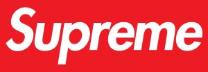
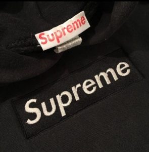
The logo you look at is Supreme’s second logo.

Supreme Recent Logo
At first James Jebbia, the owner, asks his friend to design the logo.
But it ends badly. It’s black and it’s too flat.
Later on Jebbia lends his friend a book for inspiration. Not just an ordinary book.
It’s a book by a famous conceptual artist, Barbara Kruger.

Supreme Fisrt Logo
Jebbia finds that the works by Kruger, which often characterized by bold white letters with red block background, very provocative and captivating.
And it’s inline with Supreme who wants to look rebellious and anti capitalist.
Not long after, Barbara Kruger sues Jebbia because Supreme logo comes out very similar to Kruger’s signature style.
For the typeface, Supreme uses Futura (bold italic). A very popular typeface at that time.
FYI, Futura is one of the best typeface ever created. It requires 4 years for Paul Renner to finish it.
Futura is an exceptionally versatile typeface. Its bold variant are suitable for display design.
It’s simple, clean, efficient and stylish.
