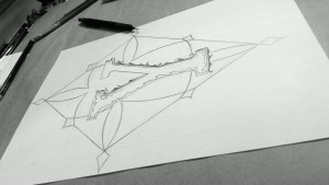
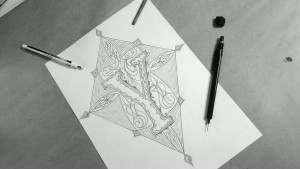
This session is a bit different than the “Z session”.
It was planned and sketched before it was drawn.
In other words, it lacked of spontaneity and it took pretty much time.
For the letter, I chose a serif letter with a contrast thick and thin.
I just felt it would fit the theme. A sans would be too naked.
The ornaments’ inspired by some Celtic ornaments and some motorcycle striping.


