1. Garamond

Made by Claude Garamond in Renaissance Era, in the sixteenth century, this font has been baptized by time and considered as one of the greatest font that’s ever made. Garamond typeface is attractive and graceful in print. Many popular books use this typeface. Such as Dr. Seus range of books, Harry Potter, etc. Even google used Garamond as their logo in the early period.
“Garamond was quite the master who appreciated restraint as much as elegance. The subtlety of line and detail are simply remarkable,” said Robert Slimbach
2. Meta Serif

Erik Spiekermann, a giant in typography industry. A professor in University of Arts, Bremen. It took three years for him to develop this typeface. You can see the “behind the scene story” in this link.
Meta Serif’s very suitable for text or headline. In some cases it can be used as display typeface too.
Trent Walton had a positive comment about this typeface. “This hard working text face seems to pair well with – and even elevate – just about anything it accompanies. I use it on my blog and have never detected even the slightest hint of disharmony as I swap out headline typefaces from post to post.”
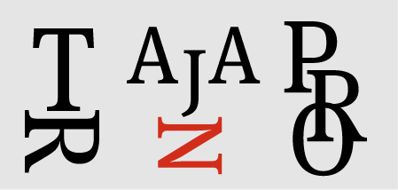
3. Trajan

Inspired by Capitalis Monumentalis, a column located between the Greek and Latin libraries in front of the Basilica Ulpia, Trajan was designed by Carol Twombly in 1989. At that time, it was touted as the next big thing. Typographer love to use Trajan because its truly classical feel, its combination of complexity and subtlety and its distinct proportions and geometry.
Some company used this typeface as a logo. The Barneys New York, for example. And it didn’t stop there, Trajan really got its grasp on Hollywood. Over the last 25 years Trajan has appeared on many movie posters. From Shakespearean Epic like “Titus” to “The Human Centipede”. More than 400 movie posters had used Trajan.
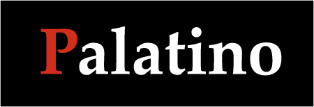
4. Palatino

Designed in 1948 by Hermann Zapf, Palatino is one of the most used typeface in the world. The name “Palatino” was taken from Italian calligrapher Giambatista Palatino. Hermann Zapf himself is a calligrapher, that’s why his typeface is highly legible and readable. Some magazine and newspaper use this typeface as headline-text and body-text. It is highly functional typeface that can be used in any setting and any purpose. With lighter strokes and larger proportions, Palatino is relatively easier to read.
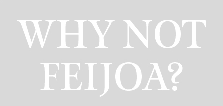
5. Feijoa

Designed by Kris Sowersby in 2005, Feijoa was very suitable for display-text or body-text. Peters Yves beautifully describe this font. “Its distinctive feature is the almost complete absent of straight lines, which makes for warm and sensous design. Those gently curved straights and rounded corners lend the design a beautiful organic, almost calligraphic quality. Yet there is nothing frivolous to the typeface, it all is functional and looks very self-assured.”
